Monday, November 30, 2009

Evolution of Youtube 11-30-09

I've recently searched through archive.org for past versions of websites in order to evaluate their evolution. Today's website is Youtube. Youtube is a fairly young site, so there hasn't been that many changes.

Youtube 2005


The original site started out very small, judging by the size of the content area. This was before Google, the search engine, bought Youtube.

Youtube 2006


After Google bought Youtube in 2006("Youtube"), the site grew in complexity and number of videos. The site's hits and number of members have also grown. As a result of the buyout, media companies have also joined the site in order to promote their products.

Youtube 2009


Three years later, the logo has not changed and the site has expanded to include even more videos. Now the site even shows full episodes of TV shows and movies. In a few short years, Youtube has come a long way.

Works Cited

"YouTube -." Wikipedia, the free encyclopedia. Web. 01 Dec. 2009. [http://en.wikipedia.org/wiki/Youtube].

Friday, November 27, 2009

Evolution of GameFAQS.com 11-27-09

I have recently searched through archive.org's Wayback Machine to look up old designs of websites so that I could compare them with the websites' most recent designs and see how they evolved.

Today's website that I will study is GameFAQs.com. For those unfamiliar with this site, GameFAQs contains walkthroughs, codes, and cheats the gamer subculture can use to get past a difficult part in a video game that they are currently playing.

GameFAQs 1996


In 1996, GameFAQs didn't look like what we see it as today. In fact, it wasn't called GameFAQs.com. It was called the Video Game FAQ Archives, and back in its creation, there were much fewer consoles to cover than there are today. The main colors were initially black and red. It also used visual metaphors as links to games under the console of choice.

GameFAQs 2008


This design is much different than the one back in 1996. The main colors are different: blue, gray and white. These colors are much calmer and friendly than the black and red of the old design. The full name of the website was streamlined to simply GameFAQs. It is more complex than the other design, with the additions of a poll, top 10 games, top 10 wanted FAQs, and more.

GameFAQs 2009


This site hasn't changed its design much from 2008. This current design does contain an ad for the new Left 4 Dead 2 game, but other than advertising new games as their Cascading style sheet, there is not much difference from 2009.

Evolution of Purdue University's website 11-27-09

This entry is about the evolution of the main website for Purdue University, one of IUPUI's parent universities. As for evolution of websites, I have searched through archive.org and its Wayback Machine to study old designs of websites.

Purdue 1997


Note: some of the images in this archived site are broken.

This is Purdue's 1997 website design. Like other designs of this time, they were fairly simple, compared to the more complex websites of today.

Purdue 2008


As of 2008, the design has evolved into a more complex website with audience-centered organization at the right side and topic-centered organization within the banner. This site design also contains the school colors of Purdue: gold and black.

Purdue 2009


This site design hasn't changed that much from 2008's design, which makes me believe that this website design had become popular enough to not have changed that much in a year.

Wednesday, November 25, 2009

Evolution of Indiana University's website 11-25-09

This entry is about the evolution of the main website for Indiana University. As for evolution of websites, I have searched through archive.org and its Wayback Machine to study old designs.

Indiana University 1997

Similar to the 1997 website design of its "daughter" school IUPUI(see IUPUI post), there is an image map. However, there are also links below the image map. There is also more color in the background than the 1997 IUPUI page.

Indiana University 2009

The newest design of the IU website takes advantage of Contrast and Proximity in the links on the left border of the site. There is also audience-centered links on the top border. A search bar has been included. The two main colors on the site is crimson red and white, the school colors.

Evolution of IUPUI's website 11-25-09

This entry is about the evolution of the main website for Indiana University-Purdue University-Indianapolis(IUPUI). As for evolution of websites, I have searched through archive.org and its Wayback Machine to study old designs.

IUPUI 1997


The earliest known design of the IUPUI website used an image map that housed the main links of the website. Other than that, there's nothing note-worthy, as is the case for most websites back in 1997.
IUPUI 2009

By 2009, the website had evolved beyond what was first shown in 1997. There are more topical links, a search feature, and added colors. The colors in this main page are crimson/red(one of the colors also used in the logo) and dark gray.

Note: I would have shown the 2008 design of the IUPUI page, but I wasn't able to find a version that did not have broken Jpeg images or lost CSS.

Monday, November 23, 2009

Evolution of MSN.com 11-24-09

I have recently searched through Archive.org to see how certain websites have evolved. This entry is about the Microsoft Network website, better known as MSN.com.

MSN.com 1996


Note: I had cropped this image slightly to save space, because there was nothing to the right except extra space.

At its beginnings, MSN had a simple design with ad hoc links inserted within. All websites and pages were simple back in the mid-1990s, and MSN was no different.


MSN.com 2008


Twelve years later, MSN has since evolved into a more complex website with more topically-organized links and more services, such as news, video and weather.

MSN.com 2009

In 2009, MSN.com has gained more color in its design. There is a wealth of information on the site, which can create a poverty of attention(Herbert Simon, "Attention Economy"). It seems to suffer from the same problem that Yahoo!(see Yahoo! post) had: starting off simple, then becoming more complex. There is a wealth of information on the site, which can create a poverty of attention("Attention Economy"). My belief is that "less can be more". Google(see Google post) has less on its main page, but its focus was the search engine itself, which can provide millions of results at a time.

Works Cited

"Attention economy -." Wikipedia, the free encyclopedia. Web. 25 Nov. 2009. [http://en.wikipedia.org/wiki/Attention_economy].

Evolution of Yahoo! 11-24-09

I have recently searched through Archive.org to see how certain websites have evolved. This entry is about Yahoo!

Yahoo! 1996


This is the first version of Yahoo! from 1996. Yahoo!, as a search engine, predated Google by 2 years. As Google was simple in its design back in 1998, Yahoo! was also simple and had its main topics in alphabetical order, just like the Harvard University Website from 1997(see Evolution of Harvard entry).
Yahoo! 2008

Twelve years after its first design, Yahoo hadn't changed much as far as simplicity went. They now offered more services than its first design as well. This design is also more compact than the original 1996 design.
Yahoo! 2009

Sadly, Yahoo! got rid of simplicity in its most recent design and opted to put more information in its home page. They have added a list of "popular searches" to their site and offered customizability, but a new person might get lost in this website and not know what to do.

Evolution of Google 11-23-09

I have recently searched through archive.org in its Internet Archive Wayback Machine to uncover the past designs of the famous search engine Google.

Google 1998 version 1


Google 1998 version 2

According to the web address archived by Archive.org, Google was initially a project of Stanford University back in 1998. It doesn't seem too different from today's design of the search engine, other than the exclamation point in the logo and the simpler functionality back then.

Google 2008


A decade later, Google has acquired a different, more slender font for its logo, and it has a simpler design and an additional task bar with links to different services, including its email service named Gmail. (You'll have to excuse the broken image. This was archived.)

Google 2009


Not much has changed a year later. Google still maintains the same design and features from its 2008 design. (Also the email address is censored)

Evolution of Harvard University's website 11-23-09

I have started searching for possible design journal ideas on archive.org, because its Internet Wayback Machine can show how certain websites have evolved over the years from 1996 to now.

The first entry of the series will be on Harvard University's website.

Harvard's website 1997


At its beginnings, the Harvard website was simple and only had the links categorized in alphabetical order. It may be organized, but it wasn't as organized as it could be. It seemed that back then, they didn't think to condense everything into general topics.

Harvard's website 2008


Eleven years later, this version of the Harvard website is more condensed and slightly more complex in its design. The Harvard logo and its official color, Crimson, are now visible on the website, along with other photos.

Harvard's website 2009


In 2009, the website was redesigned, and it is even more compact than the previous design. To me, this is for the best, because it makes navigation around the site feel the smoothest of the three. It also uses the gestalt principles of organization, including proximity for the "Harvard and the World" links and the links in the banner.

Saturday, November 21, 2009

Ball vs. Optical Mouse 11-21-09

Ball Mouse


Optical Mouse


This entry will be about two different types of computer mice. One is movable with a rubber ball, while the other is moved by laser sensor. I actually like the laser mouse more than the ball mouse, because the ball mouse tends to get dirty after a while. The dirt causes the rubber ball to slow down or even stop moving. You would have to take out the rubber ball to clean it, but that increases the chances of losing the mouse's ball, thus rendering the mouse useless and forcing you to buy another mouse.

The optical mouse is more economic and less susceptible to the "missing parts" problem. You need only have the mouse on a firm surface and move your mouse around. Unless your optical laser or the mouse's wire is damaged, then there is no problem.

Wednesday, November 18, 2009

Mario Bros. and Wario Bros. 11-18-09

This entry will be about the Mario Bros.(Mario and Luigi) and their arch-rivals, the Wario Bros.(Wario and Waluigi) from Nintendo.

Mario and Luigi


Mario and Luigi wear the colors red and green respectively. Since Mario wears red, a warm color, this means he is more active and energetic. Luigi wears green, which is a cool color, so which means he doesn't tend to be as energetic and confident as Mario is. Red and green complement each other, so the two brothers have to be opposites of each other, especially in height. Mario is shorter and fatter, and Luigi is taller and thinner.

Wario and Waluigi


The Wario Bros. are the sneaky and underhanded versions of the Mario Bros. As their "evil" dopplegangers, they maintain the Marios' main traits. Wario and Waluigi wear complementary colors(Yellow=Wario; Purple=Waluigi). Waluigi, like Luigi, is the thinner and taller brother. Wario, like Mario, is the fatter and shorter brother.

The "complementary" pair was actually first popularized by the comedians of the 1930s-1940s such as Laurel and Hardy and Abbott and Costello(shown below).

Laurel and Hardy


Abbott and Costello


The "complementary" pair was also popular with movie critics Roger Ebert and the late Gene Siskel(shown below).


Tuesday, November 17, 2009

Bowser from Super Mario Bros. 11-17-09

This entry will be about the villainous Bowser aka King Koopa from the Super Mario Bros. series.

Bowser made his first appearance in Super Mario Bros. for the Nintendo Entertainment system. Bowser is a giant firebreathing turtle who threatens the peaceful Mushroom Kingdom and is the nemesis of the main character, Mario. The scales, claws and horns make him almost dragon-like, but the spiked shell reminds us that he is a turtle-type creature. The spiked bracelets were added to make him seem more of a threatening villain.

In the Super Smash Bros. series of games, Bowser has the ability to transform into a more monstrous version called Giga Bowser. His horns become larger and more curved, the spikes on his shell become more pronounced, and his tail grows spikes, much like a stegosaurus(shown below).


There also exists a giant turtle monster known as Gamera, who has had a series of movies in Japan. This monster, who made its debut in 1965("Gamera"), may have inspired the creation of Bowser.


Works Cited

"Gamera -." Wikipedia, the free encyclopedia. Web. 17 Nov. 2009. [http://en.wikipedia.org/wiki/Gamera].

Tuesday, November 10, 2009

Green and White Flags 11-17-09

Pakistan Flag


This is the national flag of Pakistan. Pakistan is a predominantly Islamic country("Pakistan"), therefore they use the crescent moon and star in their flag. However, the crescent moon symbol existed before Islam, but was adopted by the Ottoman Turks("Crescent"). Green is also a sacred color of Islam. According to WikiAnswers, green is "one of the colors of heaven"("WikiAnswers").

Nigeria Flag

This flag was created in 1960 after Nigeria became independent from Britain. The green represents land and the white represents unity("Nigeria's Flag"). Green is a natural color and most of Africa is natural, since it contains jungles, savannahs, and animals, such as lions, elephants, giraffes, and so on. Some groups of people in Africa also farm.

Works Cited

"Crescent Moon - Symbol of Islam?" About.com Islam. Web. 21 Nov. 2009. [http://islam.about.com/od/history/a/crescent_moon.htm].

"Nigeria's Flag - EnchantedLearning.com." ENCHANTED LEARNING HOME PAGE. Web. 21 Nov. 2009. [http://www.enchantedlearning.com/africa/nigeria/flag/].

"Pakistan -." Wikipedia, the free encyclopedia. Web. 21 Nov. 2009.
[http://en.wikipedia.org/wiki/Pakistan].

"Pakistan Flag." Flags and Nations of the World. Web. 22 Nov. 2009.
[http://www.flags-flags-flags.org.uk/pakistan-flag.htm].

"WikiAnswers - What does red green and white mean in islam." WikiAnswers - The Q&A wiki. Web. 22 Nov. 2009.
[http://wiki.answers.com/Q/What_does_red_green_and_white_mean_in_islam].

Blue and White Flags 11-11-09

Israel Flag

El Salvador Flag


Greece Flag


Honduras Flag


This entry will be about flags with the blue and white color scheme.

What do blue and white mean in each country's context?

The blue and white in Israel's flag represent the Jewish prayer shawl, which symbolizes holiness and Heaven above. The Star of David is also an important symbol in Judaism("Flag of Israel").

In the El Salvador flag, the blue means "the sea and the sky; vigilance, truth and loyalty, perseverance & justice" and the white means "peace and honesty"("El Salvador").

In the flag of Greece, the symbolism of the colors is as follows
:
The color blue represents the sea which is so important to Greece and such a major portion of its economy. The white represents the waves on the ocean. Blue has also always been a color of protection, seen in the blue eye amulets used to ward off evil, and white is seen as the color of purity. ("Greek")
It is from this description that we believe that the blue and white in the Greek flag mean purity and goodness.

Finally, the blue in Honduras' flag symbolizes "the sea and the sky; vigilance, truth and loyalty, perseverance & justice" and the white symbolizes "peace and honesty"("Honduras").

So the common symbol of these two paired colors are that of holiness and of purity and goodness. This is very appropriate since blue and white are easy on the eyes.

Works Cited

"El Salvador Flag." Flags and Nations of the World. Web. 11 Nov. 2009. [http://www.flags-flags-flags.org.uk/el-salvador-flag.htm].

"Flag of Israel -." Wikipedia, the free encyclopedia. Web. 11 Nov. 2009. [http://en.wikipedia.org/wiki/Flag_of_Israel].

"Greek Flag - Flag of Greece - The Meaning of the Greek Flag." Greece Travel - Travel to Greece. Web. 11 Nov. 2009. [http://gogreece.about.com/od/greekflag/a/greekflag.htm].

"Honduras Flag." Flags and Nations of the World. Web. 11 Nov. 2009. [http://www.flags-flags-flags.org.uk/honduras-flag.htm].

Monday, November 9, 2009

White and Red Flags 11-10-09

Canadian Flag


Japanese Flag


Peruvian Flag


Austrian Flag

All of these flags have a common color scheme: Red and White. But what does Red and White mean in each context?

First, let's look at the Canadian flag. Its main symbol is the maple leaf, colored in red. Interesting fact from Wikipedia's article on Maple Syrup: "Quebec, Canada, produces most of the world's supply of maple syrup"("Maple Syrup").

Now let's look at what white and red mean in the context of Canadian culture.

An response to this question on WikiAnswers says that "The colours on the Canadian flag have no official significance"("WikiAnswers").

World Flags 101, however, states:"In 1921, the Canadian flag's official colors were proclaimed by King George. The color red was taken from the Saint George's Cross and the color white from the French royal emblem"("Canada").

What do red and white mean on the Japanese flag? Since Japan is referred to as "the land of the Rising Sun", we can assume that the red circle is the sun itself.

But what does white mean in the context of the Japanese flag? According to a site named flags-flags-flags.org.uk, white on the Japanese flag means "peace and honesty"("Japanese"). Red also means "hardiness, bravery, strength & valour"("Japanese").

In the context of the Peruvian flag, the coat of arms contains a vicuna(a mammal related to the llama), a cinchona tree(source of quinine[medicine]), and a cornucopia of gold coins("Peru").

Red and white on the Peruvian flag mean the same thing on the Japanese flag("Peru").

The Austrian flag colors have identical meanings to the Peruvian and Japanese flags("Austrian").

Works Cited

"Austrian Flag." Flags and Nations of the World. Web. 11 Nov. 2009. [http://www.flags-flags-flags.org.uk/austrian-flag.htm].

"Canada Flag - World Flags 101 - Canadian Flags." Flags of the World. Web. 10 Nov. 2009. [http://www.worldflags101.com/c/canada-flag.aspx].

"Japanese Flag." Flags and Nations of the World. Web. 10 Nov. 2009. [http://www.flags-flags-flags.org.uk/japanese-flag.htm].

"Peru Flag." Flags and Nations of the World. Web. 10 Nov. 2009. [http://www.flags-flags-flags.org.uk/peru-flag.htm].

"WikiAnswers - What do the colors on the Canadian flag mean." WikiAnswers - The Q&A wiki. Web. 10 Nov. 2009. [http://wiki.answers.com/Q/What_do_the_colors_on_the_Canadian_flag_mean].

Mexican and Italian Flags 11-9-09

Mexican Flag


Italian Flag


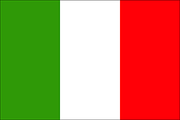
These two flags have one thing in common: the same color scheme(green, white, and red). They are also aligned in the same way. There is only one difference between them. The Mexican flag has an eagle attacking a snake as its logo.

According to both a webpage titled "Flag Symbols" and Houseofnames.com, the eagle represents God, Heaven, good, and the sun, while the snake represents evil.

The snake as a symbol of evil has precedent, especially in The Biblical book of Genesis. The snake, known also as a serpent, successfully tempted Adam and Eve to eat an apple from the Tree of Knowledge, against God's wishes, thus banishing both of them from the Garden of Eden.

The eagle as a symbol is also used in the United States. In fact, the bald eagle is the official bird of the United States.

Now as for the colors, the site three-musketeers.net states the following:

Green usually means "nature, the environment, good luck, youth, vigor, jealousy, envy, and misfortune".

White usually means "angels and gods, as the color reflects that which is sacred and pure".

Red usually means "strong emotions, or things of strong emotions rather than intellectual ideas. For example, red can symbolize excitement, energy, speed, strength, danger, passion, and aggression."

We must now compare that with what experts say about the colors of each flag.

According to the webpage called Flag Symbols,

* Green symbolizes Hope, the deep Aspiration to return to the unity of the being, who is torn between his different contradictory aspirations and to the union of the beings gathered under the same banner.
* White depicts Faith of the beings ready to undertake this return voyage, the total abandonment to the divine powers symbolizing unity and the trust without limits in Gods and oneself.
* Red means divine Love, the Love that supports us alongside the way towards the deep reality of our nature in which we are only one.

However, is it the same thing for the Italian flag? For green and white, yes, but red in the Italian flag actually means charity, according to The Italian Flag 101.

So there you have it, the Mexican and Italian flags, same colors, almost identical meanings.

Works Cited

"Flag symbols: Mexico, the eagle and the serpent-LOTUS". Lotus-At the Heart of Symbolism. Web. 10 Nov 2009. [http://users.skynet.be/lotus/flag/mexico0-en.htm]

"The Italian Flag 101." In Italy Online - Hotels in Italy, Villas in Italy, Lodgings in Italy, Traveling to Italy and Information about Italy. Web. 10 Nov. 2009. [http://www.initaly.com/gene/flag101.htm].

"The Story of the New York State Bird." New York State Bluebird Society Home page. Web. 10 Nov. 2009. [http://www.nysbs.org/nysbird.htm].

"Symbolism - eagle." Coats of Arms (Family Crests) & Surname Histories. Web. 10 Nov. 2009. [http://www.houseofnames.com/xq/asp/keyword.eagle/qx/symbolism_details.htm].

"Symbolism: Colors." Three-musketeers.net -- Fun Stuff For the Web. Web. 10 Nov. 2009. [http://www.three-musketeers.net/mike/colors.html].

Thursday, November 5, 2009

Mobile Phones with Tracking technology 11-5-09

http://news.cnet.com/Mobile-phones-that-track-your-buddies/2100-1039_3-6135209.html

This article on CNet is about how cell-phone service provider Boost Mobile has offered a demonstration of their new technology called Loopt, which helps cell-phone users track their friends’ location.

http://news.cnet.com/Helio-adds-new-GPS-enabled-phone/2100-1039_3-6133856.html

This CNet article is related to the previous one, as it also involves a cell-phone that uses “tracking” technology. The phone is called Drift and is offered through the cell-phone service provider Helio.

This phone uses a Global Positioning system (or GPS for short, hence the headline) to track where the cell-phone owner is, just in case they’re lost.
Frankly, I’m surprised as to how far the cell phone has gone. GPS cell phone apps can be helpful in the long run, especially when you get lost while camping or your car breaks down. It can also reduce the reliance on paper maps if it could, since you’ll always have a map with you, provided that you don’t lose the phone or your phone doesn’t lose battery power. Moving towards a more “paperless” future is especially important for the environment. Also keeping track of your friends is also important in keeping your social life intact. You’ll be able to meet your friends at the mall, or at school to study, or any other activity.