This blog entry is about Digital Candy 2.2, a digital search engine for BitTorrent. To those who do not know what BitTorrent is, the home website for BitTorrent explains that it is “…a protocol (a set of rules and description of how to do things) allowing you to download files quickly by allowing people downloading the file to upload (distribute) parts of it at the same time,” (“What is BitTorrent?”, BitTorrent) We know that BitTorrent deals with digital media, because of the word “bit”, but what does “torrent” mean? According to Dictionary.com, torrent can mean “a stream of water flowing with great rapidity and violence” (“torrent”). It seems that the use of the word “torrent” is metaphorical and refers to the file download speed. Digital Candy can help someone find files very quickly as well.
Works Cited
"What Is BitTorrent?" BitTorrent. Web. 28 Oct. 2009. [http://www.bittorrent.com/btusers/what-is-bittorrent].
"torrent." Dictionary.com Unabridged. Random House, Inc. 28 Oct. 2009. [Dictionary.com http://dictionary.reference.com/browse/torrent].
Wednesday, October 28, 2009
Digital Penguin Online 10-28-09

This blog entry is about Digital Penguin Online. The first thing you’ll notice is that the website has a red background and overall red color scheme. However, according to the Wikipedia article about penguins, penguins usually live near the South Pole, mainly in Antarctica (“Penguin”). Since penguins live in the cold, red would not be the best color for this website, because according to three-musketeers.net, red is “the color of blood and fire” (“Symbolism: Colors”). Fire implies warmth, so therefore this color should not be used. A better choice should be a color scheme of blue, light blue, and white since blue is associated with cold and white is associated with winter and snow (“Symbolism: Colors”). Light blue would be a mix of the two. Also, blue suggests the color of water(“Symbolism: Colors”), and since penguins can swim(“Penguin”), this makes the color blue that much more appropriate for the context of a penguin.
Works Cited
"Penguin -." Wikipedia, the free encyclopedia. Web. 28 Oct. 2009. [http://en.wikipedia.org/wiki/Penguin].
"Symbolism: Colors." Three-musketeers.net -- Fun Stuff For the Web. Web. 28 Oct. 2009. [http://www.three-musketeers.net/mike/colors.html].
Edit: Forgot to add title to blog and had to fix some "meta" tag problems.
Tuesday, October 27, 2009
Indianapolis Flag 10-26-09

This entry is about the Indianapolis Flag. First off, the red, white, and blue motif has been used before in the United States Flag. Therefore, the colors may mean the same thing here.
Blue may mean loyalty, Red may mean courage, and white may mean purity and innocence.
However, unlike the U.S. flag, the design in this flag is quite simplistic. The "cross" with the star in the middle represents the crossroads of the downtown Indianapolis area all intersecting at Monument Circle, where the Soldiers and Sailors' Monument is located. The red spot with the star in the middle represents the Monument itself. The red in this particular flag, according to Wikipedia, symbolizes "...the driving energy and urge for progress that has made the City of Indianapolis race ahead." This quote is rather fitting, since the color red itself, according to three-musketeers.net, symbolizes energy.
Works Cited
"Flag of Indianapolis -." Wikipedia, the free encyclopedia. Web. 27 Oct. 2009. http://en.wikipedia.org/wiki/Flag_of_Indianapolis.
"Symbolism: Colors." Three-musketeers.net -- Fun Stuff For the Web. Web. 27 Oct. 2009. http://www.three-musketeers.net/mike/colors.html#red.
"Symbolism: Colors." Three-musketeers.net -- Fun Stuff For the Web. Web. 27 Oct. 2009. http://www.three-musketeers.net/mike/colors.html#red.
The Indiana flag 10-27-09
 This blog entry is about the state flag of Indiana.
First, I'll talk about the colors used for this flag.
Blue, according to about.com, symbolizes "stability and unity", especially in this case.
Yellow, according to Wikipedia.com, symbolizes "warmth" and "friendship". Warmth is especially appropriate since the central icon on the flag is a torch.
Now I'll talk about the symbols within the flag.
There are 19 stars in the flag. The 19th one is below the word "Indiana", signifying that it is the 19th state in the United States. Each star represents a state at the time of Indiana's induction.
According to the Indiana Historical Society website:
"...Thirteen stars shall be arranged in an outer circle, representing the thirteen original states; five stars shall be arranged in a half circle below the torch and inside the outer circle of stars, representing the states admitted prior to Indiana; and the nineteenth star, appreciably larger than the others and representing Indiana shall be placed above the flame of the torch."(Indiana Historical Society)
As for the torch, the Indiana Historical Society website also says, "The torch in the center stands for liberty and enlightenment; the rays represent their far-reaching influence,"(Indiana Historical Society). The IHS website states that the flag was created in 1917, which is about 30 years after the Statue of Liberty(shown below) was created. The icon of the torch was also used in the Statue's creation.
Statue of Liberty

I probably wouldn't be surprised if the creator of Indiana's flag was inspired by the Statue of Liberty herself.
Works Cited
"Blue Color Meaning - Colors That Go with Blue and The Meaning of the Color Blue." Desktop Publishing - Tutorials and Software Recommendations for Desktop Publishing, Graphic Design, and Typography. Web. 27 Oct. 2009. [http://desktoppub.about.com/cs/colorselection/p/blue.htm].
"Yellow -." Wikipedia, the free encyclopedia. Web. 27 Oct. 2009. [http://en.wikipedia.org/wiki/Yellow].
"Yellow -." Wikipedia, the free encyclopedia. Web. 27 Oct. 2009. [http://en.wikipedia.org/wiki/Yellow].
Indiana Historical Society. Web. 27 Oct. 2009. [http://www.indianahistory.org/pop_hist/people/whatis.html#flag].
Monday, October 26, 2009
G1 Megatron vs. Movie Megatron 10-26-09
G1 Megatron


Movie Megatron


In today's blog post, I'm going to be comparing the two different versions of Megatron from the Transformers universe. Megatron, for those who don't know, is the leader of the Decepticons, the villains of the series who try to take over the universe.
G1 Megatron is a bit more iconic, and can transform into a Walther P-38 pistol. He looks intimidating in his own right, but not as intimidating as the movie counterpart.
Movie Megatron doesn't really look recognizable, especially with his overhauled character design. Not only does he look more organic than the G1 Megatron, but he also resembles a monster. He'd probably be more likely to give kids nightmares. The movie version transforms into a jet.
Both versions have the color gray/silver as a predominant color scheme.
According to three-musketeers.net, gray/silver represents "intelligence" and "maturity", qualities appropriate to leadership.
Gray and Silver also adds to Megatron's metallic nature, approriate since he is a robot.
But which do people like more?
According to googlefight.com, there are more "G1 Megatron" results than "Michael Bay Megatron" results.
Works Cited
"Symbolism: Colors." Three-musketeers.net -- Fun Stuff For the Web. Web. 26 Oct. 2009. [http://www.three-musketeers.net/mike/colors.html#silver].
"Google Fight : Make this fight with googleFight G1 Megatron VS Michael Bay Megatron." Google Fight : Make a fight with googleFight. Web. 26 Oct. 2009. [http://googlefight.com/index.php?lang=en_GB&word1=G1+Megatron&word2=Michael+Bay+Megatron].
Wednesday, October 21, 2009
American Flag 10-22-09

Almost immediately, you should know what this is. This is the American Stars and Stripes flag.
This flag has been the symbol of this country for over 200 years. But what does it signify?
Some of us know that the stars symbolize all the states in the union. Some of us also know that the stripes are the original 13 colonies. But what do the colors of the flag mean, and how do they represent us as a country?
First, we'll start with red.
Red, according to Wikipedia and three-musketeers.net, symbolizes passion, aggression, and blood, which some of the original colonists have shed for their freedom from the British.
Red may also symbolize "leadership, conservatism (North America)*, and democracy (USA)*"("Red", Wikipedia).
Now, we will move on to white.
White, also according to Wikipedia and three-musketeers.net, stands for purity and good, which means they want to stand for justice and freedom towards all, because they believe that that is a good thing.
Finally, we will analyze the color blue.
Blue, according to three-musketeers.net, stands for stability and security.
According to Wikipedia, it also symbolizes capitalism, universal conservatism, and liberalism in the US.
How accurate my analysis is depends on what other people say about the flag. According to Charles Thompson, Secretary of the Continental Congress, via usflag.org, when he referred to the Great Seal, which had the same colors as the flag:
"The colors of the pales (the vertical stripes) are those used in the flag of the United States of America; White signifies purity and innocence, Red, hardiness & valour, and Blue, the color of the Chief (the broad band above the stripes) signifies vigilance, perseverance & justice."(Charles Thompson, USFlag.org)
Turns out the colors aren't too far off.
Works Cited:
"Symbolism: Colors." Three-musketeers.net -- Fun Stuff For the Web. Web. 22 Oct. 2009. [http://www.three-musketeers.net/mike/colors.html].
"USFlag.org: A website dedicated to the Flag of the United States of America - What do the colors of the Flag mean?" USFlag.org: A website dedicated to the Flag of the United States of America. Web. 22 Oct. 2009. [http://www.usflag.org/colors.html].
"White -." Wikipedia, the free encyclopedia. Web. 22 Oct. 2009. [http://en.wikipedia.org/wiki/White].
Uses of Red in Movie Posters 10-21-09
Godzilla 2000

King Kong vs. Godzilla
 Both of these movie posters have something in common. Besides the obvious destruction, chaos, fire, and the appearance of Godzilla, they also have the color red. Why did the designers of these posters choose red?
 According to www.three-musketeers.net, red symbolizes "strong emotions, or things of strong emotions rather than intellectual ideas. For example, red can symbolize excitement, energy, speed, strength, danger, passion, and aggression."("Symbolism: Colors") Godzilla is known for strong emotions and its destructive wrath and is mainly associated with aggression, strength, and anger. There is also a fight between Godzilla and King Kong, another giant monster associated with rage and aggression.
With what we know about the color red, we can see that the use of red is very fitting with these posters.
Works Cited
"Symbolism: Colors." Web. 21 Oct. 2009.
{http://www.three-musketeers.net/mike/colors.html}
Monday, October 19, 2009
Universities with Crimson School Colors 10-19-09
Indiana University Logo

Harvard University Logo
University of Alabama Logo

This journal entry is about universities that use a common color. This entry centers around the color Crimson. The above images that use Crimson are as follows:
I have also used the Online Etymology Dictionary to find out what Crimson actually means. According to that website: it means:
This journal entry is about universities that use a common color. This entry centers around the color Crimson. The above images that use Crimson are as follows:
- Indiana University
- Harvard University
- The University of Alabama.
I have also used the Online Etymology Dictionary to find out what Crimson actually means. According to that website: it means:
"'deep red color," from O.Sp. cremesin "of or belonging to the kermes" (the shield-louse insects from which a deep red dye was obtained), from M.L. cremesinus, from Arabic qirmiz "kermes," from Skt. krmi-ja a compound meaning "(red dye) produced by a worm," from krmih "worm" + -ja- "produced" (from PIE *gene-).' (Online Etymology Dictionary)
Since crimson is related to red, I looked within the Color Wheel Pro website in order to see what red symbolized. According to that website, it symbolizes "energy, war, danger, strength, power, determination as well as passion, desire, and love" (Color Wheel Pro).
Determination, passion, and strength might be qualities that are appropriate for universities, but I highly doubt that danger and war are associated with higher learning.
We can probably see now why these three schools chose these colors. Hopefully we can look at their school colors and understand why they chose them.
Works Cited
"Crimson -." Wikipedia, the free encyclopedia. Web. 19 Oct. 2009.
.
Online Etymology Dictionary. Web. 19 Oct. 2009.
.
"Color Wheel Pro: Color Meaning." Color Wheel Pro: See Color Theory in Action! Web.
19 Oct. 2009..
"Color Wheel Pro: Color Meaning." Color Wheel Pro: See Color Theory in Action! Web.
19 Oct. 2009.
Wednesday, October 14, 2009
The two Animated Jokers 10-14-09
This blog entry will be about the two versions of the Joker from the two animated series.
The first one(Batman: the Animated Series) is voiced by Mark Hamill(Luke Skywalker from Star Wars).
 This version has a lot in common with the comic version:
 Note: I would've found a more recent version, but this one illustrates my point the most.
The second version is from the more recent animated series, The Batman, voiced by Kevin Michael Richardson.
 Now it is time to compare the two designs.
The Joker from the 1990s animated series is a bit more subdued and closer to the original comic book design than the 2000s Joker. He's also campier and lighthearted than the 200os Joker.
The 2000s Joker's design makes him look crazier, wackier, more psychotic, and more energetic than the 1990s Joker. His hair also resembles a jester's cap, which beings across the message that he IS a real Joker.
Which design is more well-known? According to googlefight.com(using quotation marks), there are more search results for the Mark Hamill design than the Kevin Michael Richardson design.
The first one(Batman: the Animated Series) is voiced by Mark Hamill(Luke Skywalker from Star Wars).
This version has a lot in common with the comic version: Note: I would've found a more recent version, but this one illustrates my point the most.The second version is from the more recent animated series, The Batman, voiced by Kevin Michael Richardson.
Now it is time to compare the two designs.The Joker from the 1990s animated series is a bit more subdued and closer to the original comic book design than the 2000s Joker. He's also campier and lighthearted than the 200os Joker.
The 2000s Joker's design makes him look crazier, wackier, more psychotic, and more energetic than the 1990s Joker. His hair also resembles a jester's cap, which beings across the message that he IS a real Joker.
Which design is more well-known? According to googlefight.com(using quotation marks), there are more search results for the Mark Hamill design than the Kevin Michael Richardson design.
Kindle DX at Princeton 10-14-09


This is the Amazon.com Kindle DX e-book reader.
According to Amazon.com, the Kindle:
- Is only 1/3 of an inch thick
- Can hold 3,500 books, periodicals, and documents
- Has a 9'7" diagonally measured screen display
- Has a long battery life
- Has a built-in PDF reader
- And many more.
That's because, according to an article in the Wall Street Journal, Princeton University has given out 50 Kindle readers to 50 of its students as an experiment. Unfortunately, so far, it's meeting with mixed reviews, some of them negative. One student says that it's "cumbersome to text and type notes"(Knutson, Wall Street Journal, 9/30/09). However, many of Princeton's professors and faculty say that it's too early to give the Kindle a review just yet.
Personally, the Kindle is much better than carrying around textbooks from class to class. I know, because I also carry around textbooks from class to class, so I hope that the Kindle becomes more popular in universities soon.
Works Cited
Knutson, Ryan. "DX Goes to Princeton." Wall Street Journal [New York City] 30 Sept. 2009, Technology Journal sec.: B5. Print.
"Amazon’s Kindle DX: Not Yet a Hit on Campus - Digits - WSJ." WSJ Blogs - WSJ. Web. 14 Oct. 2009.
"Amazon.com: Kindle DX Wireless Reading Device (9.7" Display, U.S. Wireless, Latest Generation): Kindle Store." Amazon.com: Online Shopping for Electronics, Apparel, Computers, Books, DVDs & more. Web. 14 Oct. 2009.
Tuesday, October 13, 2009
Boneless Chicken Wings 10-13-09
In the New York Times, dated October 13, 2009, there is an article in the first page, headlined: "'Boneless' Chicken Wings? Cheaper by the Dozen". The main idea is that more and more bars and restaurants, such as the chain Buffalo Wild Wings, are shifting from regular Buffalo Chicken Wings to chunks of skinless, boneless chicken breast that is "fried, and sauced, and sold, with marketer's brio, as [boneless wings]"(Neuman, New York Times, October 13, 2009). This is because of the rising price of regular boned chicken and the lower price of the boneless chicken breast.
I think boneless chicken wings are better than regular wings, because the bones don't get in the way of the meat, so this could be a better business strategy for restaurants who mainly serve chicken wings.
Unfortunately, it's difficult to find any poll or survey on which people like more: boneless or regular wings. However, the article does state:
For wing-centric restaurants, boneless wings are a way to attract customers who may not like
the messiness of wings, which have to be chewed off the bone. And with prices upside down, the boneless wings now act as a hedge, with the lower-cost breast meat offsetting higher wing costs.
Neuman, William. ""Boneless" Chicken Wings? Cheaper by the Dozen." New York Times 13 Oct. 2009: A1+. Print.
I think boneless chicken wings are better than regular wings, because the bones don't get in the way of the meat, so this could be a better business strategy for restaurants who mainly serve chicken wings.
Unfortunately, it's difficult to find any poll or survey on which people like more: boneless or regular wings. However, the article does state:
For wing-centric restaurants, boneless wings are a way to attract customers who may not like
the messiness of wings, which have to be chewed off the bone. And with prices upside down, the boneless wings now act as a hedge, with the lower-cost breast meat offsetting higher wing costs.
But wing lovers sneer. (Neuman, New York Times, October 13, 2009)
Neuman, William. ""Boneless" Chicken Wings? Cheaper by the Dozen." New York Times 13 Oct. 2009: A1+. Print.
Saturday, October 10, 2009
Windows Interface vs. Mac Interface 10-10-09
Windows XP Interface

Mac OS Interface
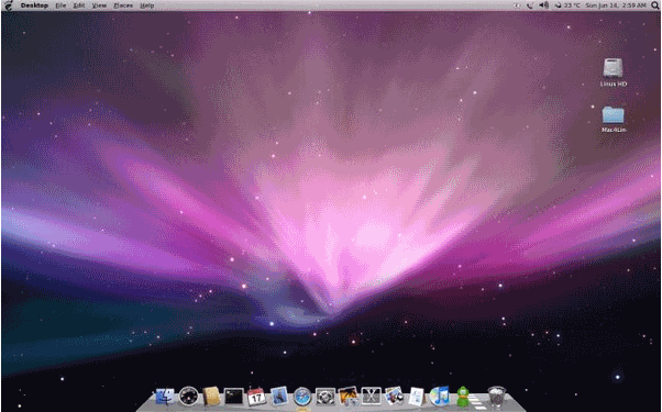 This is probably a big rivalry that has been going on since the beginning of the personal computer. This rivalry is PC vs. Mac, otherwise known as Microsoft vs. Apple. These above images are those of the Windows XP and Mac OS interfaces, respectively.
In the Windows interface, you can access the applications from a button in the bottom taskbar labeled "Start". You can also access applications from icons on the desktop. On the Mac OS interface, however, you can access all applications through icons on the bottom of the screen.
In the Windows interface, you can log off or shut down your computer by using the same Start Menu in the taskbar. In contrast, the Mac OS interface requires you to move your cursor to the top left icon and use the drop-down menu to shut down the Mac or log off.
Now the question is: Which OS do more people like and/or use?
According to a poll on Digital-Photography-School.com, 60% of voters use a Mac, while only 40% use a PC.
According to a different poll on the website Just Creative Design(click here), 51% of those who voted, graphic designers and non-designers combined, use a Mac, while 48% of those who voted are PC users.
Thursday, October 8, 2009
Death Star vs. Unicron 10-8-09
Death Star(Star Wars)
 The Death Star originated from the movie Star Wars back in 1977. The Death Star was built by the Empire and is capable of destroying planets, especially Princess Leia's home world, Alderaan. Interestingly, the Death Star also resembles a planet, or more technically, a moon, since it has a crater. This must have taken the Empire a long time to build this thing from scratch, and in space, no less.
Unicron(1980s Transformers)

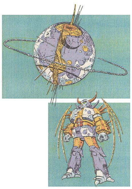 Unicron is a Planet-Sized Transformer from the Transformers series. To my knowledge, he first appeared in the Transformers: The Movie, back in 1986. He also appeared in the Marvel Transformers comics, as shown above. Unicron's transformed form is a giant metallic "planet", but unlike the Death Star, Unicron is sentient and instead of destroying planets with a laser cannon, he devours planets as food. Another fictional character who also devours planets is the Marvel comics character known as Galactus(Shown below).
 In fact, I think Unicron is pretty much the Transformers clone of Galactus.
I may do a comparison between Unicron and Galactus soon, but for now, let's just focus on the Death Star and Unicron.
According to a "fight" on Googlefight.com, there are more Google search results for the Death Star than there are for Unicron.
Also, according to an off-topic discussion poll in Gamespot.com, Death Star has beaten Unicron.
Monday, October 5, 2009
Starship Enterprise vs. Millenium Falcon 10-5-09
Starship Enterprise
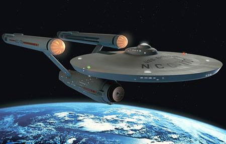
Millennium Falcon
 This blog entry will be about two competing sci-fi franchises, Star Trek and Star Wars.
Actually, to be more specific, it will be about their respective spaceships. For Star Trek, I'll pick their signature ship, the Starship Enterprise. For Star Wars, I'll pick the Millennium Falcon.
First of all, I will point out that both have a base form that resembles a disc or, even more appropriately, a "flying saucer" that was and may still be very prevalent in sci-fi media today. This is what gives both ships that type of "extra-terrestrial" flair.
Other than that, the similarities stop there with both designs. The Starship Enterprise is more rounded and has more curves than the Millennium Falcon, giving it that streamlined, sleek look. The Millennium Falcon is very detailed, but it seems to be too detailed. It's also pretty bulky.
With form, however, comes function. I take it that the Millennium Falcon is meant for attack, since the Rebels have to fight against the Empire led by Darth Vader and Emperor Palpatine. The Star Trek universe has a bit more diplomacy in place. The only enemies they had to fight in space to my recollection are Klingons and the Borg, so the Enterprise is designed for more self-defense and speed than attack.
It all comes down to what popular opinion is and how many search results there are for each.
According to a Misc. Discussion poll from HFBoards, a hockey-related forum, more people have said that the Millennium Falcon is better than the Enterprise.
According to a search result "fight" from Googlefight.com, there are slightly more results for the Falcon than for the Enterprise.
From these results, it seems that the Millennium Falcon is overall more popular than the Starship Enterprise.
Thursday, October 1, 2009
Jack vs. Heath(Joker) 10-2-09

This entry compares the two contemporary Batman movie incarnations of the Joker. By contemporary, I mean that Cesar Romero will not count in this entry. Jack Nicholson played the 1989 Joker in Batman. The late Heath Ledger played the 2008 Joker in the Dark Knight.
First, I'll just state my thoughts on the 1989 Joker. He's certainly colorful and comical. I do like that he's a bit more "light" in terms of humor than the "Dark Knight" Joker was. Also, he's a bit "classier" and a bit more of a "ladykiller" than the "Dark Knight" Joker.
Now, I'll give my thoughts on the "Dark Knight" Joker. Wow...this Joker actually belongs more in a horror movie than a Batman movie. His hair looks more disheveled and his makeup and scars make him look more of a monster than the 1989 Joker. His demented, violent, chaotic personality in the movie only further cements that fact. Needless to say, this is a person you wouldn't want to run into in a dark alley.
However, nowadays, many people seem to like Heath Ledger's Joker better than the Jack Nicholson Joker.
This poll from Faniq.com states that people like Heath Ledger as the Joker more than Jack Nicholson.
This poll from quibblo.com also states that people like Heath Ledger more.
On googlefight.com, there are more results for "Heath Ledger Joker" than "Jack Nicholson Joker".
Subscribe to:
Posts (Atom)