Wednesday, September 30, 2009

Clowns in Pop Culture 9-30-09

Clowns have always been staple of popular culture, especially on visual culture, such as comics, tv, and movies.

Clowns can sometimes make us laugh and fill us with joy.

Ronald McDonald


This clown has been the mascot for the fast food franchise, McDonald's. Most children and families around the world know his name and recognize his face and attire. He's innocent and playful, making him a great childhood icon for years to come. His red and yellow attire symbolizes not only the McDonalds logo, but a warm color scheme indicating energy and happiness.

Bozo the Clown


Though less popular than Ronald McDonald, Bozo the Clown is still an old American childhood favorite. The character has appeared on TV since the 1950s. His red, white, and blue color scheme, though not intentional, actually indicates that this clown is of American origin, since those three colors also are from the U.S. flag.

While those two clowns have made people happy, there is another side to this coin...clowns who make people absolutely miserable.

Pennywise the Clown(It)


This is Pennywise the Clown from Stephen King's It. He may have the red hair, white face, and red nose similar to Ronald McDonald and Bozo, but the fangs he bares in this screenshot make him look threatening and scary. In the movie/novel, Pennywise actually has killed some kids in the past. This may stem from some people's fear of clowns. This book/movie may further cement those fears.

The Joker(Batman)


This may be a bit cheating, but I do kinda consider the Joker a clown, since Jokers on playing cards were meant to symbolize royal jesters, who are considered clowns as well. Anyway, this is the Joker from the Dark Knight movie. He is Batman's arch-nemesis and an agent of anarchy and chaos. He tends to be violent, brilliant, and darkly humorous at times. His face is meant to resemble a clown's face, make-up and all, and he has a colorful outfit composed mainly of Purple and Green.

Tuesday, September 29, 2009

Computer Websites 9-29-09

I'm not sure if NEWM-N110 links anywhere to N201, but I have been told in that class that good interface design should be intuitive and not make people think. I apologize for the small images, but I was worried about them being too large for the blog. Two important aspects of website design, as taught in N110, are content and visual organization.


This first website is Gateway Computers. The main page's taskbar is organized very clearly, with words such as Shop, Computers, and Support. Those labels help the user know what they want to do and where to go, without getting lost. The big thing about commercial websites should be that they're easy to navigate and well-organized.

The second website is Hewlett-Packard's home website. This site, based on what I've learned about organization, is well-organized. This is because the homepage is organized both by topic and audience orientation. It is also aligned in a way that helps the user find the product as easily as they can, without getting lost. The organization also helps with navigation.


The last website for this entry is Dell Computers. The top menu demonstrates audience-oriented organization. That way, the relevant audience can search for a computer using those tabs. The homepage is also very simple and not very cluttered. Therefore, the eye can follow the website without hindrance.

Tuesday, September 22, 2009

Discover some of the most beautiful places in the World Through Dominique’s photos 9-22-09


This is another website that I discovered with Manolith's Worst Website Designs list. I have to say that the top of the site feels very cluttered with flags of other countries that the website owner visited where she took her photos.

One possible way that she could have improved this website design is by classifying the countries by continent and have them represented by tabs that say "Countries in North America", "Countries in South America", etc.

Another way that she could have improved this site is by having the countries separated by sections based on alphabetical order, such as "Countries A-M and Countries N-Z".

Those two ways can help the site gain a better visual flow and become more simple. I couldn't really find any "better" examples based on similar subject matter, because I don't really know what other sites have photos taken all over the world by their owners.

Also, the website owner needed a shorter title as well. Manovich stated that the title of this site really is that long.

Monday, September 21, 2009

Ling's Cars 9-21-09

Wow, I was looking up "Worst Website Designs" on Google. I recently found this from the site named Manolith. This site is extremely cluttered, making the navigation process impossible. Where exactly will people find any used cars on the market? New cars? On this site, you only see ads all around. Even Manolith says it themselves: "The cars themselves are buried inside mounds, literal mounds of strange and non-sequitur ads, gifs, strange images that make no sense, and creepy images that make less sense."

There are better-designed car-related sites out there, such as:

From the looks of this website, it is less cluttered than the last one. It is more intuitive, especially with the tabs at the top that tell you where you will go. There are not very many ads on this site as well, making it even easier to navigate.


This site is another example of a car selling website that's well designed. On the left side is a menu organized alphabetically and by company. This can help you find a specific company and possible make of the used car you want. There are also symmetrically organized photos of cars that are on sale. All in all, these two sites are more easily navigable and accessible to the common user than Ling's Cars. They also don't make them think as hard.

Unique Chips 9-21-09


Bugles are one type of unique chip snack that isn't like any other chip snack on the market today. Bugles are uniquely shaped like a horn (or a cornucopia, depending on how a piece is curved). The hollow part of the chip may not have much of a purpose. You could put chip dip in the hole, but the pieces may be too small to dip, this resulting in you having to dig into the dip and get your chip back, which may prove to be embarrassing at parties.


Fritos Scoops are a variation of Fritos chips that are shaped like little bowls in order to dip them into salsa, French Onion, Sour Cream, bean dip, or any other dip. However, unlike Bugles, they are larger and easier to dip. The Scoops' form obviously gives them their function.

Ruffles is another type of chip with a unique design. The Ruffles chips have signature ridges. I presume that the ridges are either made for dipping or to keep the chip slip-proof, similar to the pattern at the bottom of tennis shoes. In any case, just like the Fritos Scoops, "form is function" very much applies here.

Wednesday, September 16, 2009

Fast Food Hamburger Restaurants 9-16-09

This is the McDonald's restaurant logo. Its red and yellow color scheme can conjure up warmth and happiness. Though, aside from the trademark "Golden Arches", you wouldn't think that it was exactly selling burgers unless you see the commercials or have actually eaten there, since it gives no indication that it was a burger place anywhere in the logo.

Burger King, like McDonald's, is another fast food burger restaurant. However, unlike McDonald's, it does give an indication that it is in fact a burger restaurant. The logo has the words "Burger King" sandwiched between two "buns", just like an actual hamburger.


Wendy's logo tells us that they have "Old Fashioned Hamburgers". "Wendy's" in the logo is also typed in an early 1900s style to give that effect. Most notable is "Wendy", the girl at the top of the logo. Wendy gives a "face" to the restaurant. Also notable: Wendy is also the daughter of the late founder of the Restaurant, Dave Thomas. Like McDonalds, the Wendy's logo also uses the same three main colors, Red, White, and Yellow.

PS3 vs. Wii Interface 9-16-09


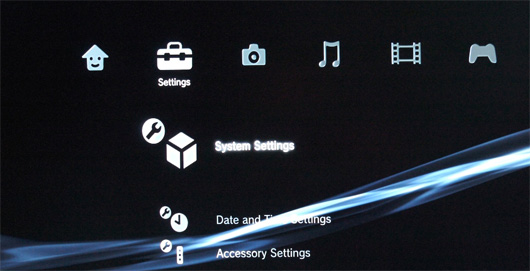
From the looks of this interface, it is very intuitive. There are symbols that resemble a smiling house(home), a toolbox(settings), a camera(photos), a musical eighth-note(music), film(movies/video), and a controller(downloaded/Blu-ray games). The symbols are very helpful in navigating the interface, almost like a regular desktop or laptop computer. Anyone who wants to buy a PS3 will like this interface very much.

The Wii Interface is different from the PS3 franchise, however. Because of the design of the Wii Remote(shown below), the Wii Interface is design to resemble TV channels. There is one in the top left that features the title of the Wii or Gamecube game that is inserted into the Wii. There is also a Wii shop channel where you can buy downloadable games to add to the interface, just like the PS3. One downside to the Wii is that, unlike the PS3, you cannot watch movies or listen to CDs/music on it.


The Wii Remote

Edit: has been expanded.

Scion xB 9-16-09


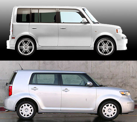
This journal entry will be about the (Toyota) Scion xB. There is an old AND a new version out now. I didn't know they have a new version out. I'm more familiar with the "box-like" old version.

Now, which version do I necessarily like? I would have to say the new version, because it's more practical for the road and its design is much better. The xB old version resembles a box on wheels far too closely. By that, I mean that the design is much too rigid for the road. Also, the box shape of the old version makes it slower than the newer version due to less curves. The newer form is more "streamlined", so to speak. Also, they got rid of the extra side window at the very back of the xB, which does feel a bit unnecessary, since the very rear is only for storage.

Tuesday, September 15, 2009

Small Two-Doored Cars 9-15-09


The Volkswagen Beetle is aptly named, because it resembles the insect that it's named after. I like that it has its distinct roundness to it. That roundness adds a sort of "cute and cuddly" appeal to it. The roundness also allows reduction in air resistance, which means it can travel a reasonable distance efficiently. However, the car is compact. In fact, it may not be perfect for overweight people, tall people, or a large number of people.

The Mini Cooper is about as small and compact as the Beetle. However, since it is more squared than the Beetle, you can possibly fit slightly more people or items inside this car. However, it is still not ideal for overweight people, tall people, or large families.

The Smart Car is smaller than both the Beetle and the Cooper. In fact, it can only probably fit two people inside. This is definitely not ideal for couples with a child. The size may make it more fuel-efficient, but if a maximum of only two people can fit, then the fuel efficiency may not make a difference.

Edit: has been expanded

Sunday, September 13, 2009

Bumblebee 9-13-09

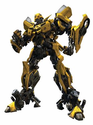
This is a follow-up post to my journal entry about Optimus Prime from Transformers. This post is about another member of the Autobots(the heroes), Bumblebee. Again, I will compare the designs from the original cartoon and the Michael Bay movies.

Bumblebee(1980s)

Bumblebee(2007-2009)
The 1980s Bumblebee, like 1980s Optimus Prime, is more geometric and simpler to draw than his 2000s counterpart. The 2007-2009 counterpart, like 2007-2009 Optimus Prime, is more organic/mechanically detailed than the 1980s version and more difficult to draw. They are similar in color, which is Yellow.

However, unlike Optimus Prime of both eras, the two Bumblebees are two different vehicles. The 1980s Bumblebee is an old Volkswagen Beetle. However, due to licensing issues, the people behind the movie had to replace the Beetle with a Chevrolet Camaro. The Camaro had the black stripe coming down the middle, which matches the stripes of a bee and is more fitting to his name.

Hopefully, these entries are good so far.

Thursday, September 10, 2009

Optimus Prime 9-10-09

This design journal entry will be about 1980s children's icon Optimus Prime. Optimus Prime is from the Transformers multimedia franchise. Recently, he has appeared in the movie Transformers: Revenge of the Fallen. Today, I'm going to compare two versions of Optimus Prime: the Classic version and the 2007-2009 Movie version.

Optimus Prime 1980s
2007-2009 Michael Bay Optimus Prime


The 1980s Optimus Prime is more geometric and has less detail, making him simpler for some people to draw than the 2007 version. The 2007 version, on the other hand, is based in live action and, therefore, is more organic and has more detail. He is, however, hard for some people to draw on paper. Both may be slightly different, but both maintain about the same color scheme: blue and red. And they both have the same alternate form: A semi-truck. I may do another Transformers character in a future blog, but I'm not certain if that counts as cheating or not.

Saturday, September 5, 2009

Mexican Restaurants 9-5-09


One of my favorite places to eat when it comes to Mexican food is Qdoba Mexican Grill. Why is it? Well, for one, they're the only fast food restaurant I know that still sells Vanilla Coke. And secondly, they have spicy salsas and fresh vegetables and meat. However, I digress. This is a design journal, so I have to talk about something design related.

Now then, this is Qdoba's logo. The restaurant serves Mexican food, so the cactus in the logo pretty much gives off that Mexican flair. It's a bit simple, but it works for what it does. It's a logo that tells us what kind of restaurant Qdoba is. I don't really see anything that needs improvement on this logo, to be honest. "Form is function" applies here, I guess.

Another Mexican restaurant that I like that I haven't eaten at in a while is Chipotle Mexican Grill. Its logo, like Qdoba, also contains something indicative of Mexican culture. In this logo, it is a chipotle pepper. The pepper symbolizes spice, which is what you will get from the food there.

Now to go more mainstream...Taco Bell is probably one of the most well-known Mexican restaurants in the world. As a result, this logo is very recognizable. The signature bell in the logo is where Taco Bell gets its name from. How is it a reflection of Mexican culture? It might be because bells may have been used in missions in Mexico, most famously the Alamo.


Edit: Had to make this more expansive.

Thursday, September 3, 2009

Rotten Tomatoes 9-3-09


This post is about the reviewing site Rotten Tomatoes. You could say that this is a sequel to my first blog about the review site Metacritic.com found here. Rotten Tomatoes is a review site predominantly about movies. The site's main theme, though, is about tomatoes. In fact, the site's grading system is based on tomatoes. According to the site's FAQ, a rating given to a movie that's above 60% is a "Fresh" tomato rating, meaning that the movie is recommended to other people to watch. Anything below 60% gets the "Rotten" score. Hence where the name of the site comes from. Where did the theme ORIGINALLY come from? This blog from Tomato Casual may have the answer.

As for which site I think is better(Rotten Tomatoes or Metacritic), I would say that, in terms of design, Rotten Tomatoes is more creative and appealing. However, in terms of overall accesibility, I would give the edge to Metacritic. Even though the design of the site is not as colorful as Rotten Tomatoes, the green-yellow-red colorcoded grading system, to me, is much more appealing, easily readable, and more convincing to me. Both sites have their strong and weak points, though, so I can't pick a End-All Be-All reviewing site.

Metacritic.com 9-3-09

Remove Formatting from selection


This entry is about the site Metacritic. Metacritic is a review site that reviews the latest movies, tv shows, video games, etc. The way Metacritic is different from most other review websites, however, is that they combine other internet and/or magazine reviews of the subject matter and then calculate an overall average score. The score is colorcoded as follows:
  • Green: For positive scores or universal acclaim
  • Yellow: for mixed(neutral) reviews
  • Red: Negative scores or universal derision
This type of reviewing system can be very useful in telling the average internet goer what movies, video games, etc. can be good to buy or at least rent. I also like Metacritic because of its review system. However, it's not entirely original. There are sites like Rotten Tomatoes that use a similar review system. I may do a blog on that site after this one.